
Today, Create Jobs for USA was launched by Starbucks and the Opportunity Finance Network – aimed at attracting donations from the general public to fund job creation programs run by OFN.
Whatever your views about US-style philanthropy programs run by large corporations, their JobsforUSA website is an almost pitch-perfect example of a campaign landing page.
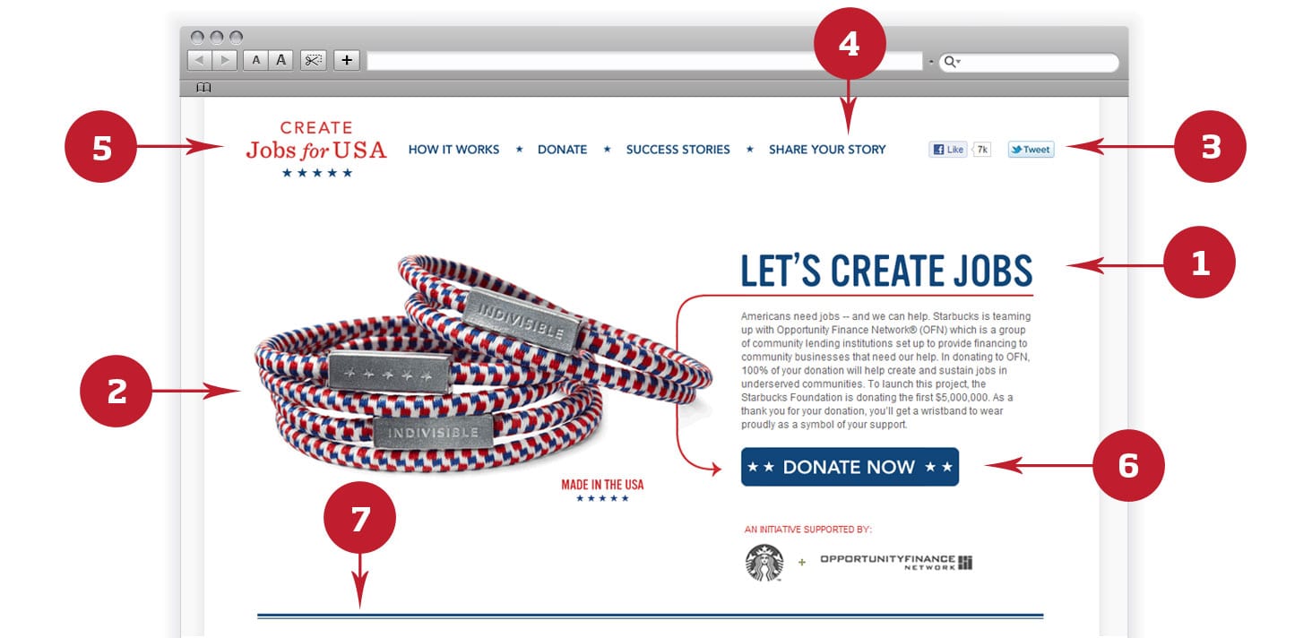
1. Clear page headline and copy
- The main heading for the page should be easy to read, specific and simple to grasp. They should compel visitors to read the copy below and then take action.
- The copy itself should be short and to the point. It should be written clearly and briefly explain the relevant details of the page’s purpose. Where the donated money goes, what the cause is about, etc.
- Remember – in all likelihood, someone who has reached your landing page has arrived there from an email or social media link — you don’t need to re-convince people to take action.
2. Use images and videos that are relevant
- Images are powerful — most people look at images before reading any text, so your images must reinforce the message in the text. In this case, the image is of a wrist-band that all donors receive as thanks — this is reinforced because of the “Made in the USA” badge below the image, indicating that jobs are being created even with the manufacture of the wrist-bands.
- Try using different images — for example, there is evidence that images of people are more effective than objects. This is one of the areas that this campaign page could possibly improve.
3. Make your site social
- Make it easy for supporters to share your page on their social networks. Facebook and Twitter are the most widely used social networks, but consider your audience. For example, LinkedIn could be useful for a campaign targeting professionals or people involved with IT and design. MySpace could be useful for a campaign targeting people of high-school age.
- The Create Jobs for USA also includes a large Facebook box (social plugin) below the fold which they use in lieu of a blog, thus allowing supporters to comment on their updates as well as share their own stories and ideas. This is a great idea and saves time and effort in maintaining a separate blog and social media accounts, merging them into a single Facebook page.
- While we’re on social media — it’s worth checking out the Facebook page for this campaign. It not only has its own specific URL, but is strongly branded to look consistent with the website, and features the same call to action that the main landing page does.
4. Keep links to a minimum and relevant
- Too many links and navigation items can distract from the main point of the landing page. The more alternatives that you give visitors to simply completing the main call to action, the greater the chance that visitors won’t complete it.
- On a landing page, keep navigation menus to a minimum. This page is also the home-page, so in this case, the minimum navigation items is fine for other usability reasons.
5. Consistent branding and unobtrusive logo
- Consistency in design is an important trust indicator for users of the Internet. When asking for money (donations) or information (email address), the person you’re asking needs to trust you. This landing page is professionally designed, with consistent branding throughout the site and its social media properties.
- Many designers despair at clients asking for the logo to be made bigger. In the case of a landing page, you want to emphasise the call to action, not your logo. The logo here serves to brand the page, while not overwhelming the purpose of the page — to solicit donations.
6. Strong call to action and a stand-out button
- After grabbing attention with your headline, convinced them to take action with your copy, you need to have a strong, clear call to action so visitors know what to do next.
- This site makes it clear what they want visitors visiting their site to do: donate money. The link appears as a large button — and as an added bonus, it is interactive. When you scroll over it, it changes colour, so it is clear that it is a button to be clicked. Small things like this improve usability.
7. Keep it above the fold, build trust and tell stories
- While this advice is controversial, there is a general view that the main purpose of your site should be viewable by visitors without requiring them to scroll down. This is not an absolute rule, but there are obvious benefits for keeping your main content “above the fold” — including the fact that it ensures that your main messages are consumed in that all-important 10 seconds.
- This particular campaign site has an important trust-building element: it includes the logos of respected and trustworthy organisations (Starbucks). An alternative to a partner organisation would be supportive quotes from respected individuals.
- If you’re soliciting donations, you should also make sure that the donation page is trustworthy, for example: using HTTPS (which is more secure than normal HTTP).
- Below the fold, the landing page includes success stories. This improves trust — showing the money donated is not wasted — as well as provides strong content for a range of purposes: media, SEO and social media sharing.
8. Test, test, test
- If you can, A/B test every element of your page.
- Things that could be tested include: the heading text, the call to action words (“donate” vs. “support jobs” for example), the colour or design of the button (red vs. blue vs. green for example), and the primary image (using a photo of a person, rather than an object).
- The reason for testing is that things that work for one campaign or audience may not work for another.
The primary goal of any landing page is to “convert” visitors into supporters/donors/buyers. If your landing page is getting lots of hits, but few conversions, then look over it and examine what could be improved. No landing page should be static — it should all be flexible enough to change and improve.